Background
I keep coming back to Gnuplot. It’s been 15 years, and I still come back to it for my plotting needs often and it has never disappointed. I used it extensively for my PhD research: monthly reports, quick updates on some new findings, academic papers, my thesis, and my final presentation. Throughout the years, I have used it for other things as well. A few years ago at work, I hooked it up to some output from a legacy system, and using the native terminal support, created a quick poor man’s dashboard. It could show the lag in our processing workflow for a real time system right inside the terminal. It was cool, as it took me a few minutes to set up, and had an old rustic look to it too! Recently, I came back to GnuPlot to generate some good looking graphs for someone else’s thesis. And I have a feeling I will come back to it again and again! If you can get it done in Python, or R, or even Excel, by all means keep doing what works for you, but to me it is crucial to separate the code and data from the instructions for generating graphs. All my code needs to know, is to write to some log file with a specific format. Afterwards, Gnuplot can generate the plots using a separate instruction file which is readable, and editable with a simple editor. And obviously the data, and the instruction file are under version control, so you can regenerate the same graph exactly as it is 10 years from now, with updated data if you must!
Basics
Gnuplot can be downloaded or installed using your favorite pacakge manager. Assuming it’s installed, let’s run it and set the terminal to dumb so that it plots the graph in the terminal itself:
$ gnuplot
G N U P L O T
Version 5.4 patchlevel 2 last modified 2021-06-01
Copyright (C) 1986-1993, 1998, 2004, 2007-2021
Thomas Williams, Colin Kelley and many others
gnuplot home: http://www.gnuplot.info
faq, bugs, etc: type "help FAQ"
immediate help: type "help" (plot window: hit 'h')
Terminal type is now 'qt'
gnuplot> set term dumb
Terminal type is now 'dumb'
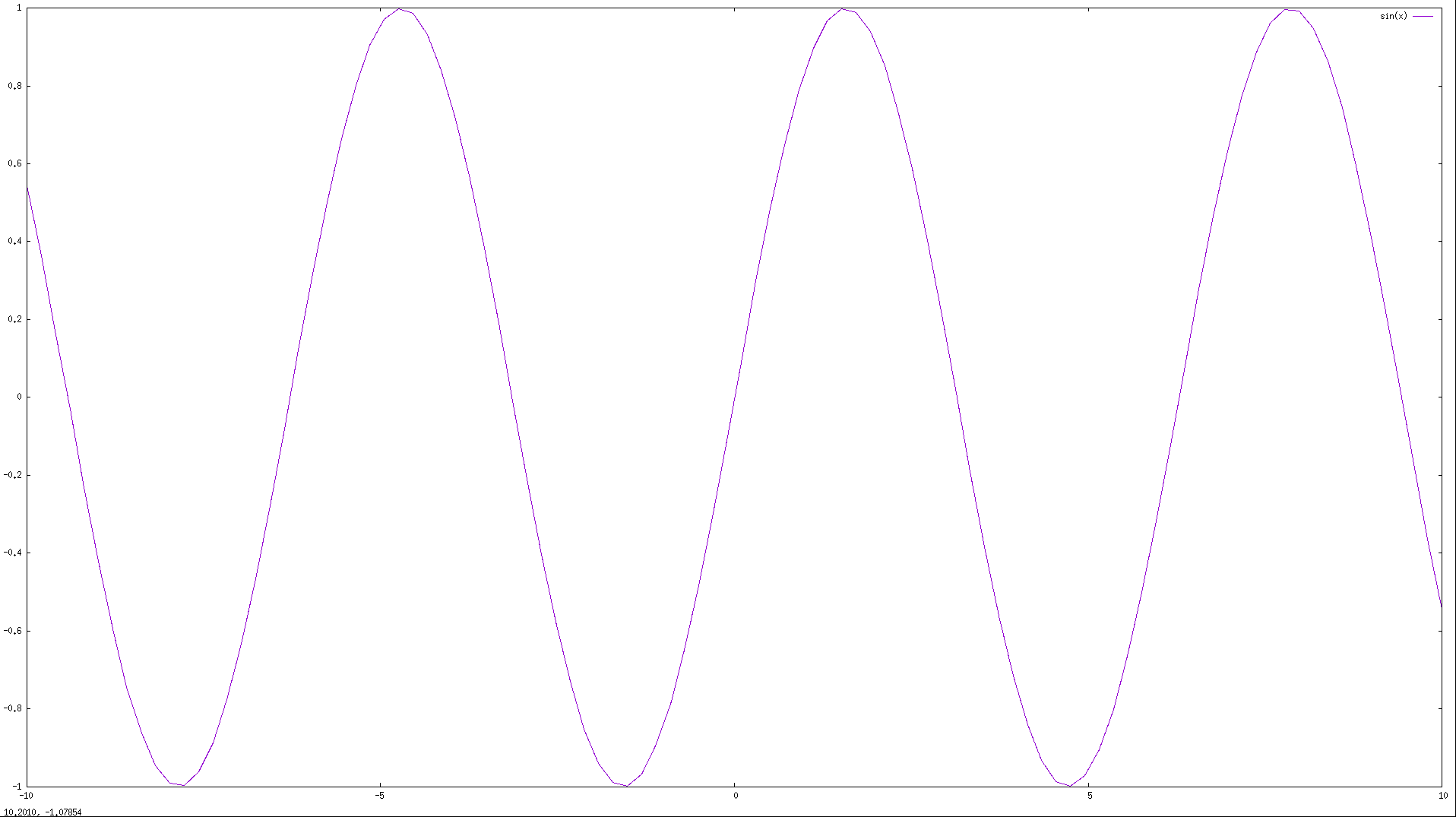
Options are 'feed size 79, 24 aspect 2, 1 mono'And let’s just plot sin(x):
plot sin(x)


    1 +--------------------------------------------------------------------+
      |                *  *              +  *  **         +       *  *     |
  0.8 |-+             *   *                 *    *          sin(x* *******-|
      |              *     *                *    *               *    *    |
  0.6 |-+            *      *              *     *               *     * +-|
      |              *      *             *       *             *       *  |
  0.4 |*+            *      *             *       *             *       *+-|
      |*            *        *            *        *           *        *  |
  0.2 |*+           *        *            *        *           *        *+-|
      | *          *          *          *         *          *          * |
    0 |-*          *          *          *         *          *          *-|
      |  *         *          *         *           *         *           *|
 -0.2 |-+*         *          *         *           *         *          +*|
      |  *        *            *       *             *       *            *|
 -0.4 |-+*        *            *       *             *       *           +*|
      |   *      *              *      *             *      *              |
 -0.6 |-+ *     *               *     *              *      *            +-|
      |    *    *               *     *               *     *              |
 -0.8 |-+   *   *                *   *                 *   *             +-|
      |     *  *       +         **  *   +             *  *                |
   -1 +--------------------------------------------------------------------+
     -10              -5                 0                5                10
May not look like much, but we typed only 2 lines so far. Let’s change the terminal to x11 so, we see the output in a separate window:
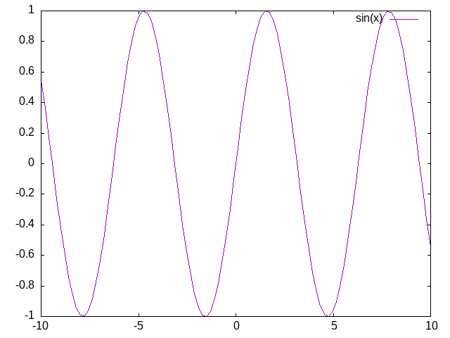
gnuplot> set term x11

Terminal type is now 'x11'
Options are ' nopersist enhanced'

gnuplot> plot sin(x)
And a separate window opnes up with this plot in it:
There are different terminals available, and the terminal basically dicates the format you want your output to be. We saw dumb (which is inside the terminal, and X11 which is inside a separtae window. You can have it generate images in png and jpg format, or eps, ps, or pdf files. The list of all terminals can be found on the documentation page. If we set the terminal to any of these formats, and try to plot, you see binray data will be printed in the terminal, we need to redirect the output to a file for the other formats to work.
gnuplot> set term png

Terminal type is now 'png'
Options are 'nocrop enhanced size 640,480 font "arial,12.0" '
gnuplot> set output "output.png"
gnuplot> plot sin(x)
And now we have an output.png file in the directory that we ran gnuplot from:
Let’s try with eps:
gnuplot> set terminal postscript eps

Terminal type is now 'postscript'
Options are 'eps enhanced defaultplex \
   leveldefault monochrome colortext \
   dashlength 1.0 linewidth 1.0 pointscale 1.0 butt noclip \
   nobackground \
   palfuncparam 2000,0.003 \
   "Helvetica" 14  fontscale 1.0 '
gnuplot> set output "output.eps"
gnuplot> plot sin(x)
And just like that we have an eps file that we can convert to a pdf using: tu
$ ps2pdf -dEPSCrop output.eps output.pdfNow, let’s put all of this in a script and run it:
$ cat plot.plt
set term postscript eps
set output "output.eps"
plot sin(x)
$ gnuplot plot.plt
$ ls output.eps
output.eps
There are other functions you can try to plot, most math functions would work, try x, x**x, sin(x)*cos(x)/(1-x), or any other function you want, list of functions Gnuplot supports can found in its documentation.
Plotting input data
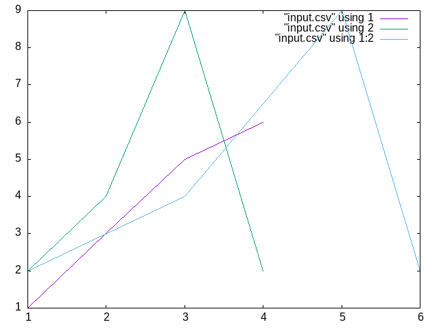
Most of the time, I don’t want to plot a function, and have my data in a csv file, it’s very easy to plot two columns of a data file. Say I have this data in my input.csv file:
$ cat input.csv
column1,column2
1,2
3,4
5,9
6,2
and this is my plot.plt file:
set term png
set output "output.png"
set datafile separator ','

plot "input.csv" using 1 with lines ,\
     "input.csv" using 2 with lines ,\
     "input.csv" using 1:2 with lines
running this file with gnuplot will result in this graph:
More advanced uses
This is the the most basic case, you can imagine more complex data formats, including date and time (that GnuPlot recognizes). You can have different types of charts, and can fine tune almost everything in the chart. Colors, sizes, styles, etc, and you can read all about those on the Gnuplot online documentation. The Gallery of Demos can give you ideas about what’s possible and how to do it.